Showing posts with label Laura. Show all posts

Sunday, 24 February 2013

Evaluation - Laura

Question 1 - In what ways does your media product use, develop or challenge forms & conventions of real media products?

1 & 2) The Ex Factor
3 & 4) Bus Baby
5 & 6) Trains and Paper Planes
7 & 8) Ascending
9) Three Amigo's


Themes and issues: We have represented the theme of domestic violence in our film. For this, we looked at many different short films representing the same thing, where we found too really good ones: Alone and Trapped (we had forgotten about this name until we realised we had used it for our film!). Arguably, both of these films challenge the conventions of this issue, as in Alone we see it from the child’s perspective, as opposed to the perspective of the abuser or abusee. In Trapped, we are also lulled into a false sense of security, when the original shot is a blurred long shot of a hospital room. We hear a non-diegetic voice over of a conversation between a man and a woman. Originally, we assume it is a diegetic conversation, where the man is coming to see the woman in hospital, asking her how she is. However, as the conversation carries on, and the man walks closer towards the bed, we learn the conversation is non-diegetic, and we hear the violence of how she got to the hospital. Yet, these are not challenging any conventions, as there are no conventions for this theme. It is important that new conventions are created for these serious themes so we can perceive the films in different ways. For example, we have conformed to the way Trapped has made the audience originally think something else (for example we change the audience’s attitude towards Sam) in order to make the audience more shocked, as they are no longer secure in what they thought.

Editing/ post-production: Ascending has used flashbacks. They have used certain props or settings to trigger these memories, for example, the sunny weather, or the photo he carries. As props are so significant, we decided to conform to this style of editing, and use props to transition to different scenes. For example, for the second flashback, Sam picks up a photo in current time, which we see in a close up, then it cuts to another close up of the same photo but with a different background (11 & 12). Yet, unlike Ascending, we used fades to make it clear that it is a different time, and a gold glow for the flashbacks to signify that it was a memory that is clear in Sam’s mind, as well as giving it a dream-quality with the use of the gold. This glow is most prominent in the first flashback, so perhaps suggesting that this was the happiest time, so one he dreams about going back to.


Here is a scan of one of the reviews I annotated in LWL. The methods I discussed can be seen here.


  2) Question 2 - How effective is the combination of your main product and your ancillary tasks?
LWL audience
 “film fans with an adventurous streak. They love cinema in all its forms, but recognise that it exists in a wider cultural tapestry, and get excited about that bigger picture too” 

Distribution
“It is the task of distributors to identify and deliver the largestpossible audience for every film”. They must make the film well-known, especially if it is being exhibited in cinema, as most cinema-goers would like to know what they are seeing first! The distributors need to know who the audience are first, as they will need to know where to distribute it. Key things they need to think about…
Approximately 10 films are released a week in the cinema, meaning that there will be many more posters out in the foyer for these customers to view. Distributors need to make these stand out to the target audience.
Sometimes teaser posters are released, however, for our ancillary task we produced a poster so that we could fully try to target our audience, by thinking about different elements we would need to use. Also, as it is a short film, it will be less anticipated then feature films, as the purpose of these are often to portray an issue as opposed to entertainment. Trailers are another marketing device, with teaser trailers too. However, as ours is a short film, we cannot make a trailer for it as there is not enough narrative! These means that the poster needs to fully display the genre and target the audience, as this is the main marketing aspect that we are relying on.
Film festivals are often used in marketing, and are especially good for short films, as it is a broad audience; so by having something short they are more likely to watch it. The Sundance Film Festival is well known for exhibiting short films.
We are only looking at short films, so the posters may not be exhibited in the cinema, however, they can still be viewed in the public sphere. Or, places that are geared more towards ‘film lovers’, like the LWL audience. Examples of this are the Duke of York, in Brighton, which is known to play quirky films that are not always exhibited in mainstream cinemas. Places like this are continually visited by ‘film buffs’, for example, with the way they have a Duke of York membership card, their own marketing device which, by giving discounts, is more likely to secure customers.

Original poster:


Final Poster
 
3) Question 3 - What have you learned from your audience feedback?


4) Question 4 - How did you use media technologies in the construction, research, planning and evaluation stages?

Here is my prezi...
http://prezi.com/wnoqvenolkum/edit/


Thursday, 14 February 2013

Outtakes! - Laura

Here are some outtakes which made us laugh whilst filming and editing! There are some deleted scenes (with a dodgy accent!), moments of laughter, and a certain, terrible contiunity error!

Wednesday, 13 February 2013

Review Third Draft - Laura

James Dunham and Laura Geall make their directorial debut in this harrowing representation of domestic abuse. In this gritty social realism, Dunham and Geall have broken societal expectations by having the female as the abuser, with the main star, Sam (Mark Summers); playing the victim. With this the audience are cleverly reminded that uncomfortable truths still lie below the surface. 

We see a character that represents a standard, Inbetweeners-style ’lad’, “going out on the pull” with his friends, criticising his “clingy” girlfriend. However, we are lulled into a false pretence of protagonist and antagonist here, and we find when Sam is in  his world away from his friends, all is not what we have been led to believe. Sam takes us through his relationship with Amy (Megan Trigg) through a series of Ascending-style flashbacks. As his memories progress, we are made witness to the subtly-growing violence.

In the first flashback the audience are made to believe that Amy is to Sam, as Lady is to Tramp. This moment of intertextuality is there to signify romance. However, by comparing their relationship to this oh-so-sweet Disney classic, Amy’s stifling nature is heightened later on, when we realise that this is far from the truth.

Amy’s psychotic, possessive tendencies are triggered by Laura, Sam’s “friend from college”. We see this in a flashback, when a cleverly edited transition reveals Amy and Sam’s confrontation after meeting Laura (Laura Geall, Snapshot). The moments of violence throughout the film are only shown to us subtly, reminding the audience of the ever-present theme that things are not always as they appear. Even in the final confrontation, Dunham and Geall rely only on the off-screen diegetic sound of Sam’s reaction. Hearing his pain is more chilling than seeing it; a cold reminder to the audience that abuse is not always visual.

Summers was given the difficult task of playing an abused college student. Even though his portrayal of the character was hardly Oscar-winning, it does nothing to ruin the overall feel of the film. Even when we see him look to the camera on occasion, Trigg’s outstanding performance just about manages to hold everything together. Her excellent portrayal of such a cold-hearted character, eerily similar to bunny-boiler Glenn Close, conveys her dominance and reiterates Sam’s weak character (whilst reminding us of Summers’ weak acting). Using unknown actors helps portray the social realist aspect, and like many other actors from this genre, Summers was plucked off of the street; in the hope of creating greater realism. These hopes are not fulfilled, however, and the casting director needs to be fired - effective immediately.

The audience roots for Sam when they realise what he is going through. We hope for him to find a way out of this relationship that he is isolated in; being truly representative of its title: Trapped. Even by the end we see there is no escape for him; as Dunham and Geall reveal the most extreme consequences of domestic abuse.

The audience are left judging themselves for criticising Sam, and contemplating whether relationships are really as they appear. The truth of this barefaced social realist film hits home with the audience, leaving them with a truly chilling feeling.

Anticipation: With it being a directorial debut from Dunham and Geall, we were tentative about the quality - 3
Enjoyment: 'Excellent, edge-of-the-seat portrayal of domestic abuse'.
- 4
In retrospect: 'Makes you take a close look at life - when is reality really the truth - 4

Tuesday, 12 February 2013

Review drafting - Laura

The tiresome amounts of redrafting that the review has undergone! Including an annotated copy from our media teacher (top). The scan of the review which is in the LWL review format is one of our last drafts, where we used the thesaurus to try to find synonyms for the words which we were using often, for example "gritty" and "possessive".

Monday, 11 February 2013

Review Ratings - Laura


For the review in Little White Lies, we have to give ratings out of 5 for our film, as well as including a short comment with three titles: anticipation, enjoyment and in retrospect.
As a group, we are bias towards our film, so we decided to get some audience feedback to help us decide. 2/3 people gave 4 for anticiaption. 2/3 people gave us 4 for In retrospect. However, there was a range of answers for Enjoyment, with 1/3 people each deciding either 3, 4 or 5. This means for the most part, we will follow the audience's ratings and give 4, however, we will have to make a group decision for what we will rate Enjoyment. We also asked for a comment from them, however, as they have not, unlike us, studied the format of the LWL reviews, they did not know what type of sentence to write. However, we can use some of the comments, but word them differently. For example, Gavin siad he was "uncertain about the quality", so we can use this to interspere that it is a "directorial debut". "Draws the audience in well", we can talk about the thrilling, edge-of-the-seat aspect of the film, perhaps 'Excellent, edge-of-the-seat portrayal of domestic abuse'. Finally, we have made a group decision on the 'In Retrospect' comment, where we will talk about how it is a good 'portrayal of domestic abuse'. Or, 'Makes you take a close look at life - when is reality really the truth?'   

Friday, 8 February 2013

Poster Design Decisions

For our poster, we had 3 designs to play with, as you can see above. 
Poster 1 includes a white phone which coincides with the phone used in our film, but as a group, we felt this didn't look as good as what the black one did in the other two posters.
Poster 1
The picture in poster 1 and 3 seemed to be the better photo as well as proved by our Audience Feedback
The picture in poster 2 was deemed to give too much away to the audience, as he is in a hospital bed and gives away too much, whereas Sam sitting in the corner with photo's around him signalling that he is "trapped" isn't such a giveaway.
Poster 2
Our final decision for our poster is design 3 as we feel this is the best represented photo for the film and the most professional looking design. Although our design is good, there are still some finishing touches to be completed that we are doing now, so we will keep you updated with the final poster shortly!

Poster 3 - Our Choice of Design

Second Draft of Review - Laura and Megan

Megan and I have now created a second draft for the review. After having a lesson on the structures of the review, and annotating some more ourselves, we have added a paragraph and changed the ordering slightly. Here it is...

James Dunham and Laura Geall make their directorial debut in this gripping representation of domestic abuse. Dunham and Geall have breached societal expectations by having the female as the abuser, with the main star, Sam (Mark Summers); playing the victim. With this the audience are cleverly reminded that what appears on the outside is not always the truth.
We see a character that represents that of a stereotypical teenage boy, “going out on the pull” with his friends, criticising his “clingy” girlfriend. However, as the college day ends, we enter a world that is far from stereotypical. Sam takes us through his relationship with Amy (Megan Trigg) through a series of Ascending-style flashbacks. As his memories progress, we are made witness to the subtly-growing violence.
In the first flashback the audience are made to believe that Amy is to Sam, as Lady is to Tramp. This moment of intertextuality is not there simply to signify romance, but to indicate that Sam is being abused. By comparing their relationship to this oh-so-sweet Disney classic, Amy’s possessive nature is heightened; reflecting the way Sam is stifled in his relationship.
Amy’s psychotic and possessive tendencies are triggered by Laura, Sam’s “friend from college”. We see this in a flashback, when a cleverly edited transition reveals Amy and Sam’s confrontation after meeting Laura (Laura Geall, Snapshot). The moments of violence throughout the film are only shown to us subtly, reminding the audience of the ever-present theme that things are not always as they appear. Even in the final confrontation, Dunham and Geall rely only on the diegetic sound of Sam’s reaction. Hearing his pain is more chilling than seeing it; a cold reminder to the audience that abuse is not always visual.

Summers was given the difficult task of playing an abused college student. Even though his portrayal of the character was hardly Oscar-winning, it does nothing to ruin the overall feel of the film. Even when we see him look to the camera on occasion, Trigg’s outstanding performance just about manages to hold everything together. Her excellent portrayal of such a cold-hearted character, eerily similar to bunny-boiler Glenn Close, conveys her dominance and reiterates Sam’s weak character (whilst reminding us of Summers’ weak acting). Using unknown actors helps portray the social realistic aspect; however, the casting director needs to be fired - effective immediately.
The audience roots for Sam when they realise what he is going through. We hope for him to find a way out of this relationship that he is isolated in; being truly representative of its title: Trapped. Even by the end we see there is no escape for him; as Dunham and Geall reveal the most severe consequences of domestic abuse.

The audience are left judging themselves for criticising Sam, and contemplating whether relationships are really as they appear. The truth of this social realist film hits home with the audience, leaving them with a truly chilling feeling.

Thursday, 7 February 2013

Review first draft - Laura

This is the first draft of our review...There are still some things we need to work out, for example, there are structural points that we need to rearrange. But we are very excited about finishing it!

Trapped James Dunham and Laura Geall make their directorial debut in this gripping representation of domestic abuse. With the main star, Sam (Mark Summers, Uncovered); playing a character that is being physically abused, the audience are reminded that what appears on the outside is not always the truth.
We see a character that represents that of a stereotypical teenage boy, “going out on the pull” with his friends, criticising his “clingy” girlfriend. However, as the college day ends, we enter a world that is far from stereotypical. Sam takes us through his relationship with Amy (Megan Trigg) through a series of flashbacks. As his memories progress we are made witness to the subtly-growing violence. However, James and Laura have breached societal expectations and twisted reality by having the female as the abuser. But is it really twisting reality? This makes the audience aware as to how ignorant we are in society, about situations of domestic abuse where men are the victims.
In the first flashback the audience are made to believe that Amy is to Sam, as Lady is to Tramp. However, this moment of intertextuality is there to signify more than just romance, but to heighten the way we later find out Sam is being abused. By comparing their relationship to this oh-so-sweet Disney classic, Amy’s possessive nature is heightened; reflecting the way Sam is stifled in this relationship.
Amy’s psychotic and possessive tendencies are triggered by Laura (Laura Geall, Snapshot), Sam’s “friend from college”. We see this in the third flashback, when a cleverly edited transition reveals Amy and Sam’s confrontation after meeting Laura. The moments of violence throughout the film are only shown to us subtly, reminding the audience of the ever-present theme that things are not always as they appear. Even in the final confrontation, James and Laura rely only on the diegetic sound of Sam’s reaction. Hearing his pain is more chilling than seeing it; a cold reminder to the audience that abuse is not always visual.

The audience roots for Sam when they realise what he is going through. We hope for him to find a way out of this relationship that he is isolated in; being truly representative of its title: Trapped. Even by the end we see there is no escape for him, as Laura and James reveal the most severe consequences of domestic abuse. 
At the end, the audience are left judging themselves for criticising Sam, and contemplating whether relationships are really as they appear. Not just because of Megan’s excellent portrayal of such a cold-hearted character, but also because of the truth of this social realist film. The audience are left with a truly chilling feeling.


Little White Lies Reviews - Laura

I have annotated 5 film reviews from Little White Lies (Hyde Park on Hudson, Flight, Bullet to the Head, Chained and Antiviral). With 3 of the annotated copies being scanned and attached in this post. I have annotated the language features, and how this lexis was used to establish an opinion, as well as creating a tone to go witth this opinion. For example, for a more negative review of Hyde Park on Hudson, the reviewer was quite sarcastic, to appear cynical of the film, but to also create comedic effect. The way these features were used, the reviewer is trying to create a connection with the reader. This is for entertainment for the reader, but also in order for them to build trust. As this is a review, the reader is relying on the reviewers opinion, so if they feel connected to them; they are more likely to believe it. For example the same review, Hyde Park on Hudson, there is a line where it says "how we Brits don't vote". This creates unity with the reader, and we know from the magazine's reader profile, as well as that their publishers are in London, that it is a British audience.
The reviews appeared rather conversational, for example with the many humorous asides "(no, that's not a euphemism)" and "(a potentially disposable one at that)". This is to keep up the connection with the reader, but it also carries on this 'quirky' theme that the magazine portrays throughout the magazine, for example, with the use of handrawn pictures making it personal.
Other features that made the review quite colloquial and quirky are: alliteration ("films familiar flightplan"), puns ("Flight takes a little too long to bring us home"), coined hyphonated compounds ("testosterone-charged buddy-movie"), onomatopoeiac words ("slam-bang" and "gulp"), common phrases ("across the pond"), colloquialisms ("stuff") and cliched expressions ("until his world turns upside down").
The phonetic features such as alliteration and onomatopoeia makes the tone of the review quite 'catchy', to, again, keep the theme of the magazine running, even through the review section. However, the use of the features such as cliched expressions and hyphonated compounds, conforms to the movie-based blog, as many of thses cliches are used in the films themselves. Furthermore, many of the hyphonated compounds that have been used, have been coined by the movie industry, for example "muscle-flexing".
There are also structural features used for a more practical purpose. For example, the use of: rhetorical questions, opening and closing summarative sentences and triplication (rule of three). The use of rhetorical questions can be used in order to make the reader of the review into an active audience, as they are having to think of answers. Alternatively though, it also creates emphasis on the point they are making, or it makes the reviewer look more knowledgable of the film if they know the answer, again building this trust. The use of summarative sentences, often in the form of declaratives as these are abrupt, making the opinion seem like a fact. These are important for the purpose of the review, as the reviewer essentially needs to give their opinion on the film. Adjectives and pre-modification is very important for this, as certian words have certain connotations, therefore reflecting the opinion. For example the use of pre-modification in the review for Flight: "unforgettable opener", has positive connotations, linking with their overall postive review. However, for Hyde Park on Hudson, the use of "directionless royal romp", has negative connotations.


I have written a rough, first draft review bearing these features in mind. I then annotated it (above), in the same frame of mind when I annotated the reviews, to see how many similar features I used. The main language features I have used are: alliteration ("cold-hearted character" and "audience aware"), cliched expression ("we enter a world"), hyphonated compounds ("subtly-growing" and "cold-hearted"), adjectives ("excellent", "chilling" and "gripping"), repetition of sounds ("chilling feeling") and a common phrase ("oh-so-sweet"). I have also used a rhetorical question to make the audience think, ("however, is it really twisting reality?"). Furthermore, I have used an intensifier ("truly"), to heighten my opinion. Finally, I have also used a pun that is similar to one of the ones I read in a previous review. I have said, "We are made to believe that Amy is to Sam, as Lady is to Tramp". This references the intertextuality that we have also used, but also conformed to the writing conventions used in LWL reviews. It is similar to one I found when annotating the review on Chained: " is an emaciated Laurel to his captor's Hardy".

Sunday, 3 February 2013

Openings for the Review - Laura

Here is the opening paragraph of the review of Zero Dark Thirty from Little White Lies
"On 1 May, 2011, America finally got its bogeyman. When Kathryn Bigelow heard the news, she was ready to shoot Bin Laden herself, primed for a film on Osama’s escape from the battle of Tora Bora. Zero Dark Thirty is her rapid response."
We could start our review like this, having made sure during filming (despite filming on different days) that the iphone date always stayed on the 6th December, we could use a similar opening. “On the 6th of December Sam made a decision that would change his life. He made the decision to make a phonecall that may finally allow his to escape the domestic abuse he is suffering in his relationship…”. However, with our film being based around such a serious issue, we felt that this was quite a clichéd opening, representing a different genre such as a thriller.
This is an opening that I much prefer in the reviews that I have been studying, for the film 
"David Cronenberg’s son makes his directorial debut with a fascinating, icky take
on celebrity obsession that he just can't quite stretch over feature length."
I like the use of the "directorial debut", as this is the same situation that we are in, with being A2 Media students, but the review still needs to be professional. Furthermore, the adjectives such as "icky" and "fascinating", hint at the tone of the film, and the term "celebrity obsession" shows simply what the narrative is about. Here is an opening I have compiled that, again, is similar. I much prefer this for our film as the simple one-line opening reflects the simplicity of our film.
"James Dunham and Laura Geall make their directorial debut in this gripping
representation of domestic abuse."

In our audience feedback, many of our viewers have commented positively about our opening credits sequence, saying that our main prop: the iphone, was used so simply and cleverly. In the review 'Chained', I found a paragraph where they talk about the credits sequence. I thought it was written interestingly, and could be used as a frame for a possible paragraph about our credits sequence. Here is the paragraph from the 'Chained' review...
"Whether that twist is actually necessary or relevant – and I'm still undecided – this is a bleakly claustrophobic film about the ties that bind, with a closing credits sequence that uses sound alone to summarise perfectly all the preceding tensions and ambiguities about nature and nurture."
Here is a possible paragraph for our review...
"With a clever opening credits sequence that not only heightens Amy’s possessiveness and Sam’s claustrophobia, but reminds the audience that in today’s technological society, something that allows for expression and freedom, can, in fact, be stifling."

Friday, 25 January 2013

Magazine research - Laura

A common convetion to include in film posters are reviews. These will always be good reviews so it promotes the film, as well as perhaps hinting at the plot or genre. For example one of the film posters I looked at was 'Sleeping with the enemy', and a review for this was 'A classic thriller', therefore it clearly protrayed its genre. Yet, the companies that write these reviews are also indicative of the audience the film is targeting. For example, if it is a review for 'Empire' magazine, it will be for an audience who are very interested in films as all of the content is film-based, similarly to 'Little White Lies' which is a magazine we looked at for a case study.
In our film we are representing the social group of teenagers, so we decided that we needed to use a magazine which had the same audience of teenagers. Looking up magazines that have specific film content, I found one called 'Tribute', which was interesting as it has three different magazines for three different audiences: children, teens and adults. Looking through the archive, the teen magazines featured films such as: The Hunger Games, Harry Potter and Twilight. Though our film is based upon more serious issues, we can still use this magazine for a review as these films have similar audiences.
Another magazine we can use for our review is 'Empire'. Below is a profile of the magazines readership.

Thursday, 24 January 2013

Film Poster Idea - Laura

Sam looking in the mirror is a key shot during our film as it shows a moment of self-reflection, and we start to see signs of his repressed anger when he throws the concealer down (furthered with the way we have jsut seen him stabbing the microwave meal). Also, the way we only see his reflection, and not himself shows the way he is 'trapped'. and perhaps isolated as a result of his situation. So an initial idea was to use a similar shot for our film poster.
Originally we had the idea that we could see Sam in the mirror, then Amy can be standing behind him, physically showing that she is the one trapping him. However, we felt this followed too similarly to the conventions of a horror genre as use of the mriror is often used in this genre for a sinister effect. Furthermore, the audience do not know straight away that it is about domestic violence, and they are supposed to be unsuspecting of Amy in the beginning, so if she looks sinister in the poster it will give too much away.

However, we did think of ideas where we only have Sam in the shot. I have taken print screens from the film to show the various different shots we could use with Sam - though of course for the final psoter we would retakes these shots. There is the close-up where Sam is looking in the mirror. This will be the shot I will use for the final design, as it shows Sam is reflecting on himself and his life; portraying the 'realism' genre that our film conforms to. The other two shots are where Sam gets the concealer out of the cupboard, and the other shot is where Sam is opening the cupboard. I will use the first shot as it goes with out theme better than the other action shots.
In my mock design, we thought of writing the film title 'Trapped', onto the mirror because this then reminds him that he is 'trapped', even in the comfort of his own home - which is shown at the end of the film when Amy comes in without Sam knowing and asks for the phone.
  
However, when looking at the conventions of a film poster, we found that the title of the film on the poster, has to match the font of the title in the film. We used an iphone to show these titles, so I did some research to find out which font the iphone uses. "The original iPhone, iPhone 3G and iPhone 3GSsystem interface uses Helvetica." Typing this into Microsoft word, I found one that looked very similar...
Trapped
 
I tried putting a print screen of the title from the film on the phone onto the mock poster, as well as trying using this font. However, neither of them looked right against the bathroom background as they look to mechanised, so we will keep thinking of new poster ideas.


Wednesday, 23 January 2013

Trapped - The Final Film

So after weeks of editing, it is finally complete. Below is the final film, Trapped.


Film Posters - Laura

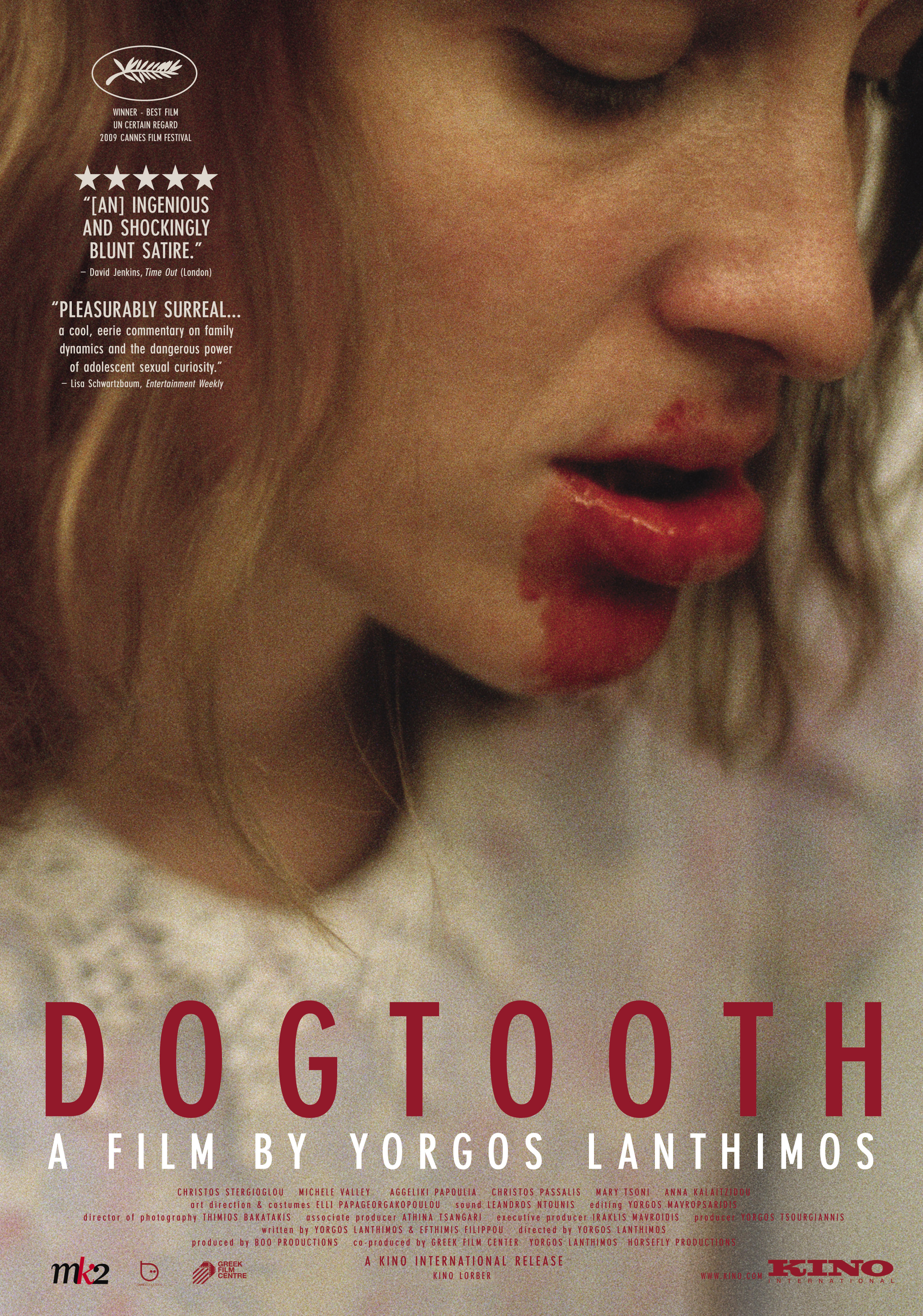
When researching film posters, I looked at one for a short film ('Broken'), and the others were for films that involved domestic abuse, as this is the theme for our film. I wanted to see how they portrayed the violent, sinister elements. Whether they were subtle, or overt. 'Sleeping with the enemy' is a thriller, and so they showed the eerie, sinister element quite explicitly as they need to make the genre clear to the audience. However, 'Dogtooth' is much more subtle, the use of the blood and her facial expression shows there is clearly something wrong, and that there are dangerous elements in this film, however the focus pull does not show us the background, and so does not give too much away. For example, in 'Dangerous Intentions', we see the man is standing behind her. She looks nervous whereas he looks quite intimidating, so we immediately relate the violence to him. In our film, the audience does not suggest domestic violence straight away, so in our film poster we will need to make the abuse subtle.

Dogtooth

Ÿ  The focus pull in this shot means we focus on the face of the girl, drawing our attention to her expression. This is furthered with the way it is a big close up.  Also, the way it is blurred makes the character seem isolated, as we cannot see the background.

Ÿ  The make-up of the blood on her face is very dramatic, and as it is the centre of the frame and our focus is already drawn to her face, it stands out to us. It is enigmatic, as the red connotes danger, furthered with the way it is blood, making it enigmatic for the audience as they are already asking questions.

Ÿ  The other text apart from the title is very subtle, this is good as it does not subtract from the errie feeling of the poster. 
  • Narrative: this poster does not give too much away in terms of narrative, as key elements of mis-en-scene have been left out, such as costume and lighting. This means we rely on her facial expression, which does not look happy; suggesting there is something more to the story. Furthermore, her eyes are closed. This is enigmatic to the audience as we wonder what secret she is hiding, but it is also suggestive of the narrative, and that perhaps something dark and sinister will be revealed in the film.
  • Representation: the focus pull means we do not see the costume, which makes it harder for us to see which social group she is representing. However, we can still see white through the blur, which suggests youth. Furthermore, the actress that is playing the character is young, suggesting that teenagers are being represented. The use of the colour white makes it seem like a positive representation, also the way it is a frilly top makes it seem quite childish, thus having vulnerable connotations. Furthermore, the way she is a teenager, she is shown to be hurt through the use of blood, and the way she is the only character in the shot suggests that she is the protagonist. All of these elements come together in the poster to make it appear to the audience that we will be empathising, or perhaps even sympathising with her throughout the film.
  • Genre: the use of blood in the actual image, and the use of the red in the credits suggesting this makes it seem gory. Yet, the way her eyes are closed, concealing her identity, suggests that there may be a sinister underlying narrative.  
  • Audience: the image of the actress features heavily in the poster. The actress looks quite young, perhaps suggesting that they are tarageting a older teenager audience, though the sinister use of blood also shows that it may be quite horrific, so it also targets adults.

Sleeping with the enemy

Ÿ  The use of the tagline: “She is a stranger in a small town. She changed her name. Her looks. Her life. All to escape the most dangerous man she has ever met. Her husband.” The use of declaratives in this creates a harsh tone, portraying the serious theme of the film as it is about abuse in relationships. Furthermore, by using the pronouns “her” and “she”, the character is not given an identity. This suggests that her “husband” has taken this away somehow.

Ÿ  There is a masculine silhouette. The way it is a silhouette makes it very sinister, as it is dark and he has no features, therefore no identity. We assume he is the “husband” who is “dangerous”, and the way that the picture of the woman is confined in his silhouette could perhaps show that she is trapped by him.

Ÿ  Similarly to the ’Dogtooth’ poster, the colour red is used for the title. However, only for the word “enemy”. The different colour makes it stand out, and as it is next to the silhouette it makes us think of the husband. Red connotes danger so we then relate the “enemy” to her “dangerous…husband”.

Ÿ  Poster 2:

Ÿ  A silhouette is used again, this time with a spotlight on the door, creating an eerire tone, suggesting the genre of the film is perhaps a thriller
  •  In both posters, the actress' name - Julia Roberts - is at the top. She is quite a highly respected Hollywood actress, so they have used a big font to make it clear to the audience that she is in it. Furthermore, this also targets a different audience to the actual film: fans of Julia Roberts.
  • Narrative: she is in the bath, suggesting that there is an intimacy between the person in the doorway, therefore assuming it is her "husband".
  • Genre: the low key lighting gives the poster a creepy and sinister air suggesting conventions of a thriller.
  • Audience: in both posters there is an adult actress that is the predominant image, suggesting this is the age for the audience.
  • Representation: she is in the bath, which shows vulnerability, suggesting that she may conform to the stereotpye that women are weak  
 

Dangerous Intentions

Ÿ  The woman’s body language in this helps to portray the theme of domestic abuse. She is biting her nails, which is seen as a nervous gesture. Her eyes are looking towards the side, and the man is behind her, suggesting that he is the one who makes her nervous.

Ÿ  The lighting has a yellow tinge to it, emphasising the dark strip that cuts across the woman’s face. This heightens the different appearances in her face, as one the dark side of it we see she has bruises. This suggests violence, then with the mans frightening expression behind we relate it to him.

Ÿ  The woman is placed below the man in the frame, which suggests vulnerability as the height gives him power. A power which her perhaps exudes through violence.

Ÿ  Alternatively, the way she has two appearances could suggest that she tries to hide this violence from the people around her

Broken
  • Narrative: This is a short film. When creating designs for our film, we did some mock designs using the image of the hospital. However, we said (and our audience feedback page supported this) that this gives too much away. In terms of narrative, the poster needs to hint at what the film is about, however as the films are 'short' they cannot give too much away about the chronology or the events.
Ÿ  The focus pull that blurs the shot and makes her only relatively clear in the background confuses the audience, making them ask questions about the plot

Ÿ  The ellipsis in the tagline “what if your truth…were a lie?” creates tension, suggesting that it is a dramatic genre. Furthermore, the way it is a question makes the audience active, as they cannot answer it, and so they want to watch the film to answer the question

Ÿ  The format is standard, the picture-text ratio is much bigger as this reveals the most about the film, for example from the blurred screen we cannot see what the character is doing, making the audience already start to ask questions. The title is then the second most important, for practical reasons as well as it having implications of what the film is about, and so needs to be the second biggest. Then the other information is often not important for the viewer, so therefore it is in a smaller print.
  •  Representation: they are representing a woman in this. She is tied to a chair, which could
    be conforming to the stereotpyical woman who is weak. Furthermore, her expression looks passive.


Saturday, 19 January 2013

Audience Feedback Overall - Laura


After putting the 4th flashback up onto Facebook, we got a text from one of our viewers saying that they thought they had spotted a continuity error, where the frying pan had changed colour from when Sam had got it down to when Amy picks it up. However, this is just because the frying pan is black on top, and silver on the bottom, so here are some pictures to prove it is not a continuity error!

Rather then just posting sections of our clip onto Facebook then having people post about it, we also got verbal feedback. Yesterday while I was editing, one of my peers, Toby Thomas came and sat with me so that he could comment on the nearly-finished film.
I asked him to watch it through once first to get his initial criticisms.
- He said that our foley audio at the end where Sam is crying, we had a foley of Mark crying overtop, Toby said that this was not needed as the tension is already heightened through the other elements of representation, such as the way it switches to low key lighting when Sam is sitting in the living room
- He also originally did not understand the bathroom scene where Sam is looking in the mirror, as he could not see what the item that Sam gets out of the cupboard. Unfortunately, we did not have a close up shot revealing it is concealer, however after we had put the college scene into the sequence, we showed Toby again and he said it was much clearer
- Finally, he also said the idea for the film was unrealistic, saying that there are “no cases of domestic where the man is the victim”. This was one criticism that we were not going to consider, however, and after showing Toby the blog posts of our domestic abuse research, he in the end had to agree.
- He liked the film overall though, and he especially liked the credits sequence. Saying it was a simple idea that worked really well, as it did not detract from the film.

Then I made changes to certain parts of the film to see which one he preferred. These were mainly changes with the audio as this is one of the parts we were having most difficulty with.
-         Originally we stopped the soundtrack when Sam gets into the car as we were going to have the radio come on at the point of the news headlines. We were going to have a report about domestic abuse, where there is a female victim. However, we decided not to use this in the end as no violence had been introduced by this point so we thought it would make it too obvious for the audience, rather than them gradually working it out through the flashbacks. As we decided to not include a report, we decided to extend the soundtrack to the shot of the tyre when Sam is driving off. Toby agreed that this was a good place to stop, as the lyrics in the song had started by then, so we did not want it to detract from the diegetic dialogue when Sam talks in the car.
-         The parts between the flashbacks have no dialogue, and so we decided to put the soundtrack over these. However, we used Toby as an audience to tell us how loud he thought they should be. Eventually we thought -19 was a good level, so that the audience is not distracted by the lyrics.

We finished the entire film today (22nd January 2013), so I decided to get some post-production feedback from one of my peers, Gavin Wallace. Things that I noticed while he was watching it...
- He liked, similarly to Toby, the opening shot where we see the credits on the phone
- He said that the action where Sam stabs the microwave meal shows his "rage", making the reader question what it is from; later finding out it is suppressed anger from being domestically abused.
- He noticed from the big close up of the phone when Sam gets in the car that there were already "9 missed calls from Amy", and that she was already appearing "clingy", furthered with way she continually calls Sam throughout the day.