After creating a first draft the group we have made significant progress in creating our film posters. We have tried and tested various methods of designs and have come up with various versions. Below is an outline of each poster draft we have made since our initial ideas with feedback from Facebook groups and our "Target 10".


White vs Black
After implementing the white iPhone we felt as a group that it didn't feel right. The white creating a slightly sickly contrast between the grey and green of the rest of the poster. It also wasn't as powerful in emphasising the dark side of our film. Although it is important that we create a poster that is consistent with the conventions of our film we feel that a black iPhone (which emphasises the dark nature of our characters and reflects well of the colour pallet) doesn't detract any attention to the consistency of our media products. What are audience thought? Further down this post we asked ten people what they thought about our three posters, you'll find more details about what they said overall below but for the question about what iPhone they prefer here are the results:
There was a 50/50 split from the ten people that took part in our audience feedback, 5 chose white and 5 chose black.
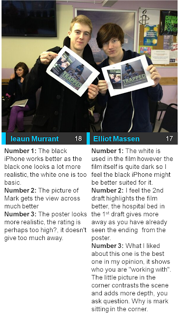
Some of the things they said:
What we said?
Despite the split in what people thought we feel that a black iPhone will suit the dark feel to our film, the white one in our eyes looks slightly off putting and as a result we have decided to choose the black iPhone. |
The first draft.  The second draft. 
After the first draft we received some feedback from our audiences which highlighted the fact that the main picture gave too much away about the film. As a result we decided to head out on location to gather some photographs that we could use for the main film image. The result is an image that is powerful and conveys the conventions of our film. Love, relationships and the darker side, domestic abuse.
All film posters that we researched contained a credit block, at some point we had to implement this so at the second draft stage we introduced it to the phone layer.
Most reviews had at least two reviews, so that we could include two reviews the Little White Lies review was made smaller, a second review was then added adjacent to it. The review by Empire magazine allows our audience to see that two major film organisations have highly rated our short film.
The transparent bar over the "Trapped" text was also removed within the second draft. We felt that it wasn't necessary as it didn't really emphasise any more about the conventions of being "Trapped".
Finally, the second draft saw the production roles size reduced, no matter how much we would like to think we are on the same level with Hollywood sadly we are not and as a result our names were reduced to fit on one line. We aligned the text so that it conformed to the grid lines set by the word "Trapped". To maintain the iPhone message theme, one message symbol has been retained and has been placed next to all of our names. This allows the element to follow the conventions of our short film. Although the second version was a big improvement on our first draft improvements were still needed. What are target 10 said? |

The third draft of our poster, has further changes.
The Trapped logo in my eyes still had something missing, as a result we implemented a subtle glow to the "Trapped" title, it makes the film title appear slightly eerie and contrasts the happy images of "Sam" and "Amy" as well as the dominant image of "Sam" in a state of confusion. A bottom block of film production companies and funding agencies in addition to a film certificate have also been added to the bottom of the image. The poster also includes a potential logo for "LMMJ Productions". The names of the companies allow the audience to know what organisations have funded or have been affiliated with the film, as a result reputable companies are likely to attract audiences.
There has also been an addition of a picture of Sam and Amy in the bottom right hand corner, although it is still uncertain if we will include this in the next version. It continues to reflect the lives of Sam and Amy but maybe makes the design a bit clutter.
What did our Target 10 think? |
 |
||
| We published the three posters on Facebook and and asked them for their thoughts above. The opinion was unanimous on what version they would like to see published. Source: Facebook.com Our target 10. We then asked ten people individually about the three versions of our poster for our feedback. The results are a clear indication that statistically our deomographic are happy with the changes that we are making by selecting the third poster. We also went around the college and asked some of our peers what they thought of the posters. |
The changes that have been made are not the final version just yet and we will continue to work on the poster until we are satisfied that is successfully reflects the narrative and conventions of our short film.


No comments:
Post a Comment